

Hello, Welcome back. Glad that you’re here.
We're building a Movie App with the best coding practices and tools. So far, I have talked about Folder Structure for Clean architecture, Datasources, Repositories & UseCase and Dependency Injection, HomeScreen, Navigation Drawer, and Language Management.
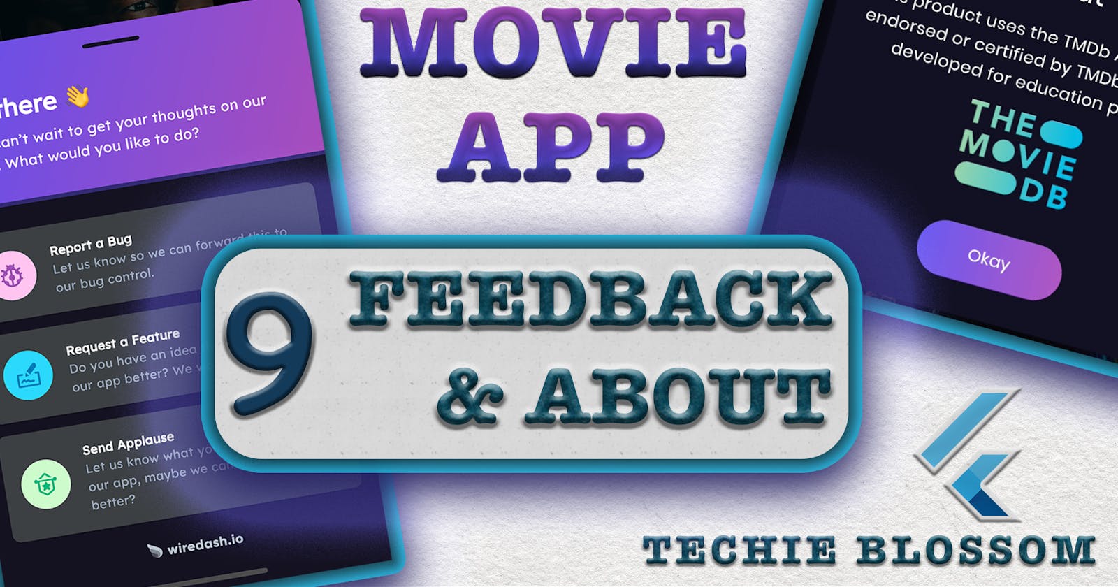
In this article, I will teach you to integrate the Feedback module into the application. I will also, show you to create an About Dialog for the application. That will be displayed when you tap on the Navigation Drawer About Tile.
I am going to integrate with Wiredash. If you haven't heard of Wiredash then, probably you would like to visit this video. %[youtube.com/watch?v=bfXKYyH-HCo]
Here, I have explained from scratch how easy it is to integrate a feedback system in the Flutter application.
Wiredash
In this article as well, I will show the basic steps to integrate Wiredash in the Flutter application. Go to console.wiredash.io. Log in with your email id and create a new project.
Once you have created a project in Wiredash, you'll see Project ID and API Secret. Those are the only two bare minimum things that you require to get going.
Add dependency in pubspec.yaml:
wiredash: ^0.2.0
Wiredash Widget
We'll wrap the MaterialApp in a widget - WiredashApp:
In the presentation folder, create a new file wiredash_app.dart:
//1
class WiredashApp extends StatelessWidget {
  //2
  final navigatorKey;
  //3
  final Widget child;

  WiredashApp({
    Key key,
    @required this.child,
    @required this.navigatorKey,
  }) : super(key: key);

  @override
  Widget build(BuildContext context) {
    //4
    return Wiredash(
      projectId: 'full_tutorial_movie_app-tue0983',
      secret: '6onx0shgp4z9i28mu4lnvxocvx30l6tv',
      navigatorKey: navigatorKey,
      child: child,
    );
  }
}
- Create a
Statelesswidget. navigatorKeythat you will mention inMaterialAppis required by theWiredashwidget, so declare a final variable for that.- You'll wrap
MaterialAppinWiredashAppso we need a child widget as well here. Both of these fields will be required fields. - In the
buildmethod, return theWiredashwidget provided by the wiredash plugin. This widget requires projectId and secret that you can get from the Wiredash project you created before. Also, pass in thenavigatorKeyandchildas the remaining 2 parameters.
This is the minimum setup that you require for Wiredash.
Now, wrap MaterialApp with WiredashApp:
//1
final _navigatorKey = GlobalKey<NavigatorState>();

//2
WiredashApp(
  navigatorKey: _navigatorKey,
  child: MaterialApp(
    //3
    navigatorKey: _navigatorKey,
    ....
    ....
    ....
  ),
)
- Initialize a
GlobalKeyforNavigationStatein the state class ofMovieApp. - Wrap the
MaterialAppwithWiredashAppwith the_navigatorKey. - Do not forget to mention the same navigator key in
MaterialAppas this is how Wiredash will bind its UI to your application.
Open Wiredash Widget
Now, we're ready to open the Wiredash widget from the navigation drawer.
In nnavigation_drawer.dart, add body to the Feedback's
onPressed():
NavigationListItem(
  title: TranslationConstants.feedback,
  onPressed: () {
    //1
    Navigator.of(context).pop();
    //2
    Wiredash.of(context).show();
  },
),
- As you're opening the feedback sheet on click of navigation drawer, you should also close the navigation drawer.
- Get the context of Wiredash and show it.
Run the application and when you tap on the Feedback tile, you'll see the Wiredash widget that opens up with options to file a bug, a feature request, or a thank you note. You can also take a screenshot of any screen in the app and apply markers to highlight a portion of the screen. All of these, I have talked about in-depth in my Wiredash Video. Do check that out https://youtu.be/bfXKYyH-HCo.
You are seeing a floating icon on your app, that is because of the default implementation of wiredash. If you want to hide that, you can go back to WiredashApp and add options.
options: WiredashOptionsData(
  //1
  showDebugFloatingEntryPoint: false,
),
- Give the value as false so that the floating logo goes off.
Wiredash Theme
You're seeing the default theme for the bottom sheet. To match it with your app theme we can provide ThemeData to the Wiredash widget.
//1
theme: WiredashThemeData(
  //2
  brightness: Brightness.dark,
  //3
  primaryColor: AppColor.royalBlue,
  //4
  secondaryColor: AppColor.violet,
  //5
  secondaryBackgroundColor: AppColor.vulcan,
  //6
  dividerColor: AppColor.vulcan,
),
- Use the
themeproperty and provide aWiredashThemeDatato it. - First, change the brightness to
darkas the main theme of our app is mostly dark till now. - For the header background, you can give
royalBlueasprimaryColorthat will go as the first color in the gradient. - For the second color in the gradient, use
violetassecondaryColor. - Provide
secondaryBackgroundColor, our main color that isvulcan. This will go behind the 3 options. - You can also change the color of the handle in the bottom sheet by using
dividerColor.
Translations
If you've seen my previous video/article where I explained how to provide translations to the application. Similarly, Wiredash also gives us options to provide the translations.
The first way is you can give the Locale to the WiredashOptionsData that will automatically change the strings based on the Locale. Currently, Wiredash supports 5 languages by default - English, Spanish, German, Polish, and Dutch.
The second way is you can give your translations. You can change the strings as per your needs as well by extending WiredashTranslations. I have covered this in the Complete Wiredash Tutorial, so I am not covering it here.
Let's work on the first way.
Use languageCode in WiredashApp
WiredashApp(
  navigatorKey: _navigatorKey,
  languageCode: state.locale.languageCode,
  child: MaterialApp(
    ....
    ....
    ....
  ),
)
- If you remember from the previous video, we get the current locale from the
LanguageLoadedstate. Take thelanguageCodefrom the state and pass it intoWiredashApp.
Now, allow WiredashApp to accept languageCode:
//1
final String languageCode;

//2
@required this.languageCode,
- Along with other fields in
WiredashAppdeclare alanguageCodefield as well. This will accept strings likeen,es, etc. - Make this field also a required field.
Lastly, you can provide locale to WiredashOptionsData:
//1
locale: Locale.fromSubtags(
  languageCode: languageCode,
)
- Create a
Localeobject from subTags and provide it to the locale field ofWiredashOptionsData.
Now, run the application. Change the language in the application. When you open the Feedback bottom sheet, you'll see the translated text showing automatically. This is the benefit of Wiredash as a feedback module for the application. There is no way, you won't love it.
Let's jump to About Dialog as the last thing in this video/article.
About Dialog
Here is how the about dialog will look like.

First, we will add an entry point for the dialog. Open NavigationDrawer and in onPressed() of About Tile, call a method to show a dialog.
onPressed: () {
  //1
  Navigator.of(context).pop();
  //2
  _showDialog(context);
},

void _showDialog(context) {
  //3
  showDialog(
    context: context,
    builder: (context) {
      //4
      return Dialog(
        //5
        backgroundColor: AppColor.vulcan,
        //6
        elevation: Sizes.dimen_32,
        //7
        insetPadding: EdgeInsets.all(Sizes.dimen_32.w),
        //8
        shape: RoundedRectangleBorder(
          borderRadius: BorderRadius.all(
            Radius.circular(Sizes.dimen_8.w),
          ),
        ),
      );
    },
  );
}
- First, close the Navigation Drawer.
- Call the method to show the dialog.
- Invoke the
showDialog()provided by the Flutter framework. - In the
builder(), return theDialog. - This dialog takes in the app's primary color.
- Give it some elevation.
- For all the content inside this, dialog we should use some padding so that the content doesn't touch the edges.
- Give this dialog a rounded rectangle shape.
If you run the app, you won't notice any significant difference when you tap on the About Tile. But, the screen has some overlay because of dialog. When you press anywhere on the screen, you'll notice the screen has no overlay now.
Let's segregate some code.
In the presentation/widgets, create a new file app_dialog.dart:
class AppDialog extends StatelessWidget {
  //1
  final String title, description, buttonText;
  //2
  final Widget image;

  //3
  const AppDialog({
    Key key,
    @required this.title,
    @required this.description,
    @required this.buttonText,
    this.image,
  }) : super(key: key);

  @override
  Widget build(BuildContext context) {
    return Container();
  }
}
- Create a
Statelesswidget. As the dialog has 3 strings, so createtitle,description, andbuttonTextfina fields. - We'll also show an image in the dialog so, directly declare a
Widgettype field, that will make this dialog generic as now it can take any type of widget. You can later rename this tochild. - Except for
imagemark all fields as required. As we're making this dialog a generic one, we will only show this image when the image is not null. In case the image is null, we'll only have the title, description, and button.
Before we move to create an actual body of the dialog, let's create add some strings to en.json, es.json, and translation_constants.dart:
{
  "okay": "Okay",
  "aboutDescription": "This product uses the TMDb API but is not endorsed or certified by TMDb. This app is developed for education purpose."
}
{
  "okay": "Bueno",
  "aboutDescription": "Este producto utiliza la API de TMDb pero no está respaldado ni certificado por TMDb. Esta aplicación está desarrollada con fines educativos."
}
static const String okay = 'okay';
static const String aboutDescription = 'aboutDescription';
Copy the Dialog widget from navigation_drawer.dart and paste in the build() of AppDialog.
Also, use AppDialog now in place of Dialog in navigation_drawer.dart with all the fields.
Now add title and description in the AppDialog:
//1
Column(
  //2
  mainAxisSize: MainAxisSize.min,
  children: [
    //3
    Text(
      //5
      title.t(context),
    ),
    //7
    Padding(
      padding: EdgeInsets.symmetric(vertical: Sizes.dimen_6.h),
      //4
      child: Text(
        //5
        description.t(context),
        //6
        textAlign: TextAlign.center,
      ),
    )
  ],
)
- Use
Columnto put children in the vertical direction. - If you use
MainAxisSize.max, the dialog will take the height of the screen. So, useMainAxisSize.min. - First thing in the dialog is the title. So use the
Textwidget to show the title. - Second thing is the description below the title. Again use the
Textwidget to use description this time. If you reload the dialog, instead of title and description, the strings in theTranslationConstantsare present. - Use the extension method that we created in the previous video. This will take the locale-specific string from the
en.jsonandes.json. Run the app now and you'll notice that the description is not in the center. - Use
TextAlign.centerto make the text-align with the center. - To give some gap between the title and the description, use Padding on the description. Give vertical padding because later we'll add an image below the description.
Add text styles to the title and the description. For the title, we will create a new headline5 text style and for description, we will use the existing bodyText2 text style.
//1
static TextStyle get whiteHeadline5 => poppinsTextTheme.headline6.copyWith(
  fontSize: Sizes.dimen_24.sp,
  color: Colors.white,
);

//2
static getTextTheme() => TextTheme(
  headline5: _whiteHeadline5,
  ...
  ...
  ...
);
- Create
headline5text style with 24 font size. - Add this style in the
TextTheme.
Use these textstyles in the AppDialog and run the app again.
Now, add the image below the description.
if (image != null) image,
- Here, we are trying to make dialog generic, so that if the image is not passed then also this dialog won't throw an error. Thatswhy renders the image only when the image widget is present.
Button
We need to create a button that can be used anywhere in the application. The dialog is one place for now. Later, you'll see this button used in Movie Detail Screen and Error Handling.
In the presentaion/widgets folder, create a new file button.dart:
class Button extends StatelessWidget {
  //1
  final String text;

  //2
  final Function onPressed;

  const Button({
    Key key,
    @required this.text,
    @required this.onPressed,
  }) : super(key: key);

  @override
  Widget build(BuildContext context) {
    //3
    return FlatButton(
      onPressed: onPressed,
      child: Text(
        //4
        text.t(context),
        //5
        style: Theme.of(context).textTheme.button,
      ),
    );
  }
}
- Button needs text to show, so give a String field.
- Give a function as well that will be called when the button is tapped. Make these fields required.
- Use
FlatButtonand pass theonPressedmethod in the onPressed property. - Use the
Textwidget to show the text. Also, use thetextension method to translate the text. - Give it a theme of a button from
TextTheme.
Now, create another text style in theme_text.dart
static TextStyle get whiteButton => poppinsTextTheme.button.copyWith(
  fontSize: Sizes.dimen_14.sp,
  color: Colors.white,
);
Now, use this Button widget in the AppDialog below the image:
Button(
  //1
  onPressed: () {
    Navigator.of(context).pop();
  },
  //2
  text: TranslationConstants.okay,
),
- In
onPressed, close the dialog. - In
text, pass the key viaTranslationConstants. Thetextension method will make this locale-specific text.
Now, run the application and you'll see the button. The button still has black color, this is because we haven't added button text style in the button text theme.
Let's go back to theme_text.dart and add the whiteButton style in TextTheme:
static getTextTheme() => TextTheme(
  headline5: _whiteHeadline5,
  headline6: _whiteHeadline6,
  subtitle1: whiteSubtitle1,
  bodyText2: whiteBodyText2,
  //1
  button: _whiteButton,
);
- Also, make this private by adding
_.
On hot reloading the app, you'll see the Okay text in white color. Let's make it as per our theme.
Open button.dart:
Container(
  //1
  decoration: BoxDecoration(
    //2
    gradient: LinearGradient(
      colors: [
        AppColor.royalBlue,
        AppColor.violet,
      ],
    ),
    //3
    borderRadius: BorderRadius.all(
      Radius.circular(Sizes.dimen_20.w),
    ),
  ),
  //4
  padding: EdgeInsets.symmetric(horizontal: Sizes.dimen_16.w),
  //5
  margin: EdgeInsets.symmetric(vertical: Sizes.dimen_10.h),
  //6
  height: Sizes.dimen_16.h,
  child: ....,
),
- Use
Containeras a wrapper forFlatButtonbecauseFlatButtoncannot accept gradients. Add aboxDecorationto theContainer. - Use
LinearGradientand give the royalBlue and violet color which are non-primary colors in our app. - Give radius from all edges to the container.
- As this is a generic button, give some padding. Otherwise, when a large text is supplied to this button, you'll see text touching the boundaries of the button.
- Since, the button is touching the image, give some margin from top and bottom as well.
- Adjust the height to something that doesn't look ugly.
Now run the app and see the dialog. It is looking ok ok. But dialog should have some elevation, which is not appropriate here. We've used Column in the Dialog, let's change that a little bit.
Open app_dialog.dart:
Container(
  //1
  padding: EdgeInsets.only(
    top: Sizes.dimen_4.h,
    left: Sizes.dimen_16.w,
    right: Sizes.dimen_16.w,
  ),
  //2
  decoration: BoxDecoration(
    boxShadow: [
      //3
      BoxShadow(
        color: AppColor.vulcan,
        blurRadius: Sizes.dimen_16,
      ),
    ],
  ),
  child: Column(
    ....
  ),
)
- First, add some top padding and horizontal padding to the
Columnby usingContainer. - Use
BoxDecorationto useBoxShadow. - By using
BoxShadowgive thevulcancolor and blur radius.
Run the app and now you'll dialog looking like an actual dialog with some elevation. Change the language also and check the translated strings in the dialog. On pressing the Okay button, you'll come out of the dialog.
This was all about adding a Feedback Module that can be used to file bugs by the end-user and a generic About Dialog. Hope you liked it. See you in the next video/article.