When and how to create Custom Implicit Animation Widget?
Transition from one shape to other shape in Flutter

With 11+ years of experience in IT industry, I have got my hands into many tech stacks - mobile app development, data analytics, backend using Java/Kotlin.
I expertise on Android(Kotlin) and Flutter(Dart).
I also run a educational YouTube channel with name TECHIE BLOSSOM.
Introduction
It was October 2022, when I was preparing for my first-ever talk - Unleash Power of AnimatedPositioned. The main highlight of the talk was to show how a complex animation like forming the India Flag from some randomly placed dots can be achieved with just a single widget - AnimatedPositioned
I came up with many use cases of this idea. But one that stood out was creating a ShapesApp, that would switch between geometrical shapes with animation, like a square to a rectangle or to a rhombus, triangle, etc. that too with dots using AnimatedPositioned. Honestly, I was too obsessed with this widget.
After trying to transition a square to a rectangle with dots, I realized that it didn't look good. Even though the above animation can be improved with some tweaks, how do I control the animation of dots for other shapes like a triangle or a kite? I had shortlisted around 50 shapes to be in my app so you can guess what a mammoth that would’ve been.
But, why I’d want to show shapes with animation in the first place? Well, I believe that if a picture can speak 1000 words then animation can speak 10x than that. Run the app yourself in the below frame and see how easy it is to remember the differences between shapes.
Eventually, I found the most optimal way by creating a Custom Implicitly Animation Widget. In this article, I will try to explain every failed approach that I took and what were the shortcomings of each approach.
Animations in general
Animations in Flutter are broadly categorized into two types - Implicit animations and Explicit animations. Simply put, if you animate the widgets using AnimationController and AnimatedBuilder by yourself, that’s an explicit animation. While using implicit animations, you only care about initial and final values that should animate, the rest is hidden from you.
Let’s take a very simple and relatable example of animating a square-shaped box to a rectangle shape. The below code has a main.dart and explicit_animation_screen.dart file.
To achieve this animation using explicit animations, you’ll generally have a Stateful widget, a AnimationController, two Tween<double>s for width and height and AnimatedBuilder. In the above frame, initially, you see a square with a width and height set to 200.
Here’s what happens when you tap the button with the “Rectangle” text:
_controllerruns in a forward direction over 1 second, producing 60 values from 0.0 to 0.1.AnimatedBuilderrebuilds theContainerfor new_width.value60 times in a second.
And here’s what happens when you tap the button with “Square” text (When the current shape is a rectangle):
_controllerruns in a reverse direction for 1 second, producing 60 values from 0.1 to 0.0.AnimatedBuilderrebuilds theContainerfor new_width.value60 times in a second.
What is an Implicit Animation Widget?
An implicit animation widget is a widget of course, that manages the complete animation lifecycle for you.
It takes a set of initial values and a set of final values. Once you start the animation, the initial values change to final values over a duration and we can visually see the changes. These values can be color, position, size, or any other thing. Let’s see how square-rectangle-square transition can be achieved using one of the already defined Implicit animation widgets.
The below code has a main.dart and implicit_animation_screen.dart file.
The output doesn’t change, but the code size and complexity have changed a lot. You’ll notice that in implicit_animation_screen.dart, there is no AnimationController, Tweens or AnimatedBuilder. There is AnimatedContainer though with a duration of 1 second instead of Container. We still have Stateful widget, so that we can change the value of width when either of the buttons is tapped.
Here’s what happens when you tap the button with “Rectangle” text:
A new
_widthvalue i.e. 400 is assigned toAnimatedContainerAnimatedContainercreates a tween under the hood and runs theAnimationControllerin a forward direction over a 1-second duration.On value change of
AnimationController,setState()is called to rebuild the widget.
Yes, Implicit animation widgets use setState() to rebuild the UI. As all these widgets extend ImplicitlyAnimatedWidget which is a Stateful widget. The state class for ImplicitlyAnimatedWidget extends ImplicitlyAnimatedWidgetState class that attaches the listener to the controller value changes and calls setState() on value change.
Everything remains the same when the “Square” button is tapped except that this time the new _width value is 200.
I believe you’ve understood how easily we can achieve the same results with the Implicit animation widget because declaring AnimationController, Tweens, and updating UI on every tick are all taken care of by the widget, we just have to use AnimatedContainer.
We’ve just scratched the surface of how the Implicit animation widget works, but we’ll see more of it in detail under the Anatomy of Implicit Animated widget section.
Matrix4 Transformations
Do we have any implicit animation that can also change its skew properties? Can I also form a rhombus from a square or a parallelogram from a square? That’s my next question when I see that square-rectangle-square is possible.
No. There is no implicit animation for that. But, there is Matrix4Tween that we can utilise together with AnimationController. We can also have a Tween<double> for skewX because by changing only skewX, you can make a rhombus from a square.
Refer to the below code:
The above code does the following:
Wraps the
AnimatedContainerinAnimatedBuilder.The
AnimatedBuilderbuilds aTransformwidget with aMatrix4definition.There is a third button - “Rhombus”, on tap of which
_controllerruns in forward direction. This changes the value of_skewXfrom 0.0 to -0.4.On tap of the other two buttons, the
_controllerruns in the reverse direction and brings back the_skewXto 0.0.
Voila! We're able to transition rhombus from square/rectangle and vice-versa. This looks awesome but there is a minute mistake introduced here.
Try changing the endvalue of _skewX to -0.8 in matrix4_animation_screen.dart file. What’s the shape? Is it a rhombus with all equal sides? No. Even though you make it work by changing the width and height of the container for the rhombus, the code becomes very complex for just 3 shapes. This was a huge deviation from the ultimate goal of creating 50 shapes. So, what’s next approach?
CustomPainter
Yes, CustomPainterenables us to access canvas api and draw anything on the screen. So, how do we utilise it to create shapes and animate them from one another? I later realised that I should’ve started with CustomPainter since the start but I learnt what won’t work and that is good.
With canvas, we can draw a polygon, arcs, custom paths, etc. So, now let's replicate square-rectangle animation. We’ll get to more shapes soon but first achieve the simplest of things before moving to complex shapes. Once the base is ready, it’ll be a cakewalk.
The below diagram explains how offsets will be placed for each of the four vertices of the square and rectangle.
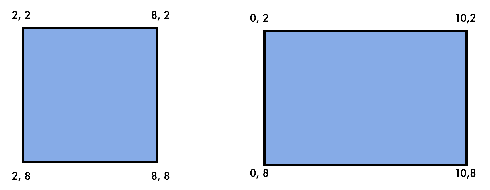
Considering that these shapes are drawn on a coordinate system, square has each side of length 6 units, whereas rectangle has longest side of 10 units in length and is shorter of 6 units.
In Flutter, the 4 points that form square and rectangle are Offsets starting from top-left, moving to top-right, bottom-right and bottom-left. To animate the value of these offsets to form a rectangle we can create 4 Tween<Offset>s. The begin value for these tweens will resemble square offsets and end values will resemble rectangle offsets.
I have taken whole numbers in the above image to make it easy to understand. But, while actual implementation we should consider the width and height of the canvas.
Let’s assume the canvas width and height to be 280, so we want the left-top Offset of the square to be Offset(280 * 0.2, 280 * 0.2) which will be Offset(56, 56). In simple terms, just divide the above coordinates by 10, when you code.
Let’s jump into code:
In the custom_paint_animation_screen.dart file, you’ll notice that I have used AnimationController and 4 Tween<Offset>s. The _width and _height resemble the canvas size, because we want each shape to be constrained.
Then, in the build(), you’ll see AnimatedBuilder building a CustomPaint.
The CustomPaint uses ShapePainter to draw path from the given 4 offsets.
In the shape_painter.dart file, you’ll see canvas.drawPoints() which uses PointMode.polygon. Here’s a brief about what each PointMode does:
pointsplaces the offsets, doesn’t draw a line between themlinesconnects 2 sequential dots and draw lines like offset 1 and offset 2 form a line, then offset 3 and offset 4 draw another line, and so on.polygonconnects all the points sequentially
The second parameter takes a list of offsets. You’ll notice that offset1 is repeated at the last position because we want to form a closed shape.
The third parameter takes in a Paint to style to the shape. The glow around the lines is because of maskFilter.
When “Rectangle” button is pressed, the _controller runs in the forward direction and all 4 offset tweens reach their end values to form a rectangle. The exact opposite happens when “Square” button is pressed.
You might wonder, why I am using explicit animation here if there is an implicit animation widget that animates CustomPaint. But, there is no such widget as of now in the SDK. So, all we’ve to deal with is explicit animation. So, the next question is - Can we make and animate Rhombus, Triangle, or any other polygon shape with CustomPainter? The direct answer is YES. But, there are complexities in doing that with explicit animation.
Complexities with CustomPainter and Tweens
Let’s understand the transition of offsets from the below diagram:
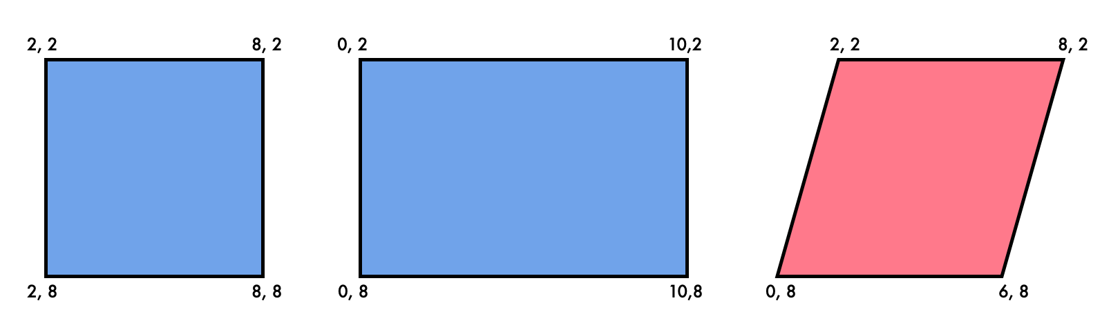
We’ve seen how we could animate from square to rectangle with Tween. When we want to animate to rhombus we need new tweens or update the older tweens with a new begin value resembling offsets of the current shape(rectangle) and end value resembling offsets of new shape i.e. rhombus. Also, a rhombus can be animated back to a square or rectangle, so, at any point in time, we will have an initial shape and a final shape. Maybe this is confusing while reading, so below is a tabular view of this. For simplicity, this table has the tween value for the bottom-right vertex only while animating square-rectangle, rectangle-rhombus and rhombus-square.
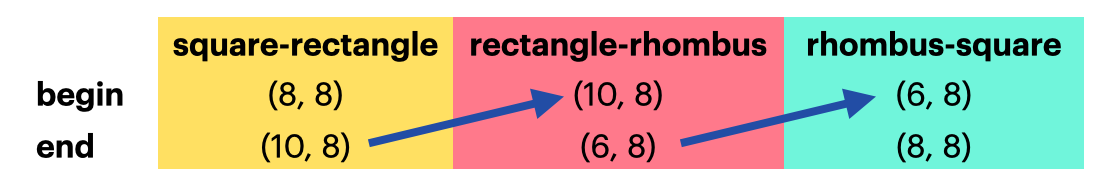
Referring to the arrows - the end value of the square-rectangle transition becomes the beginning value of the rectangle-* transition, where * can be any shape. Deciding and updating the tween as per the current and next shape is the first complexity.
The next complexity is to decide when to move the animation controller in the forward direction or reverse direction. That raises a question How implicit animation widgets are doing this? When we use AnimatedPositioned widget and change its left/right/top/bottom attributes, it easily animates the properties from current to next value. Thinking of this excited me to look at Implicit animation widget functionality. Maybe creating my implicit animation widget is what is needed here for my app. Let’s see how the Implicit animation widget works.
Anatomy of Implicit Animated widget?
Let’s see how AnimatedPositioned widget looks like. First and foremost AnimatedPositioned extends ImplicitlyAnimatedWidget.
class AnimatedPositioned extends ImplicitlyAnimatedWidget {}
The Stateful widget
The ImplicitlyAnimatedWidget extends Stateful widget which means that there must be a separate State class as well that will manage its state. The ImplicitlyAnimatedWidgetState class is that state class that also uses SingleTickerProviderStateMixin.
abstract class ImplicitlyAnimatedWidgetState<T extends ImplicitlyAnimatedWidget> extends State<T> with SingleTickerProviderStateMixin<T> {}
Well, as soon as you see SingleTickerProviderStateMixin, you can guess that soon or later there will be a AnimationController in the class. This covers half of the boilerplate code that you would require to implement explicit animation. The next half covers the Tween declaration and running the animation controller.
There is also a base abstract class already created that deals with adding a listener to the animation controller and calling setState(), when the animation controller’s value changes.
abstract class AnimatedWidgetBaseState<T extends ImplicitlyAnimatedWidget> extends ImplicitlyAnimatedWidgetState<T> {
  @override
  void initState() {
    super.initState();
    controller.addListener(_handleAnimationChanged);
  }

  void _handleAnimationChanged() {
    setState(() { /* The animation ticked. Rebuild with new animation value */ });
  }
}
AnimatedPositioned's state class should be of this type so that the controller listener and updating UI are also taken care of automatically.
The State class
Let’s come back to AnimatedPositioned widget and refer to the left property which is of double type. There are other properties as well, but for the sake of explaining I will take only one property.
The state class for AnimatedPositioned is _AnimatedPositionedState. It declares a Tween<double> for left property.
Tween<double>? _left;
Next, there is a callback function forEachTween(), which does the initialisation and updation of the tween with the help of a TweenVisitor. Remember, this was our first complexity to update the tween for the current and the next value. So, what is this visitor? Let’s decode that.
_left = visitor(
    _left,
    widget.left,
    (dynamic value) => Tween<double>(begin: value as double),
) as Tween<double>?;
It takes three parameters:
The
_leftis the tween itself, it can be the first initial tween or can be the updated tween for 2nd transition from the above table (rectangle-rhombus)The
widget.leftis the next value. This is the value that you assign toleftattribute forAnimatedPositioned.The third parameter is a Tween constructor. It initialises the tween with a value. What is that value? For that, we’ve to find where this
forEachTween()is invoked.
Auto-creating the Tweens
The answer lies in the ImplicitlyAnimatedWidgetState class. This is the same class that uses SingleTickerProviderStateMixin and initialises animation controller. In the initState() of this class, there is a call to _constructTweens().
bool _constructTweens() {
  bool shouldStartAnimation = false;
  forEachTween((Tween<dynamic>? tween, dynamic targetValue, TweenConstructor<dynamic> constructor) {
        //1
    if (targetValue != null) {
            //2
      tween ??= constructor(targetValue);
            //3
      if (_shouldAnimateTween(tween, targetValue)) {
        shouldStartAnimation = true;
      } else {
                //4
        tween.end ??= tween.begin;
      }
    } else {
      tween = null;
    }
    return tween;
  });
    //5
  return shouldStartAnimation;
}
If
left(targetValue) property is unassigned or assigned as null, then ideally nothing should be happening.A fresh tween is created because
leftvalue is non-null. This is what??=does. It assigns value only if the variable is currentlynull.The
_shouldAnimateTween()checks if thelefttween’s end value or begin value is equal to thetargetValue. This will befalseas this is the first value assigned toAnimatedPositioned.The
constructorcreatedTweenwith onlybeginvalue earlier, but here the tween now hasendvalue equal tobeginvalue as well.Since there was no need to animate,
falsevalue is being returned from this function.
Auto-updating the Tweens
This was all about creating the tween under the hood. What happens when you assign a new left value to AnimatedPositioned widget. The didUpdateWidget() is called:
@override
//1
void didUpdateWidget(T oldWidget) {
  super.didUpdateWidget(oldWidget);
  if (widget.curve != oldWidget.curve) {
    _animation.dispose();
    _animation = _createCurve();
  }
  _controller.duration = widget.duration;
    //2
  if (_constructTweens()) {
    forEachTween((Tween<dynamic>? tween, dynamic targetValue, TweenConstructor<dynamic> constructor) {
            //3
      _updateTween(tween, targetValue);
      return tween;
    });
        //4
    _controller
      ..value = 0.0
      ..forward();
    didUpdateTweens();
  }
}

void _updateTween(Tween<dynamic>? tween, dynamic targetValue) {
  if (tween == null) {
    return;
  }
    //3
  tween
    ..begin = tween.evaluate(_animation)
    ..end = targetValue;
}
When there is a configuration change for
AnimatedPositioned, like a newleftvalue is assigned thendidUpdateWidget()is invoked.Remember, the
_constructTweens()will returntruewhen a newleftvalue is assigned.The
_updateTween(), will evaluate a newbeginvalue and assign it to the tween. The newleftvalue becomes the newendvalue. This is updating of tweens, which was the first complexity.The
_controlleris set to start from 0.0 and move in the forward direction, so this solves our second complexity of running the controller in some direction.
All of this is part of ImplicitlyAnimatedWidget and its state class ImplicitlyAnimatedWidgetState. However, there is one more thing that you need to do apart from overriding forEachTween() in your widget:
@override
Widget build(BuildContext context) {
  return Positioned(
    left: _left?.evaluate(animation),
        // ... other properties
    child: widget.child,
  );
}
In the build(), you need to assign a value to AnimatedPositioned's left value by evaluating the tween with the current value of the _controller. All in all, if you're a single value for a Animated* widget, you’ll at minimum need the below widget:
class AnimatedX extends ImplicitlyAnimatedWidget {
  const AnimatedX({
    super.key,
    required super.duration,
    required this.left,
        this.child,
  });

    //1
  final double left;

  @override
  ImplicitlyAnimatedWidgetState<ImplicitlyAnimatedWidget> createState() => _AnimatedXState();
}

class _AnimatedPolygonState extends AnimatedWidgetBaseState<AnimatedPolygon> {
    //2
    Tween<double>? _left;

    @override
  void forEachTween(TweenVisitor<dynamic> visitor) {
        //2
    _left = visitor(_left, widget.left, (dynamic value) => Tween<double>(begin: value as double)) as Tween<double>?;
    }

    @override
  Widget build(BuildContext context) {
    return X(
            //3
            left: _left?.evaluate(animation),
            child: child,
        );
}
Briefly and for simple widgets, if you’re to create an “Animated” version of a widget “X”, you need to follow the below 3 steps:
Define property to animate
Declare and update the tween in
forEachTweenEvaluate the latest value and assign it to the widget
***************************************************************************Note: The way you evaluate final value differs when you’ve opacity, alignment, etc. property. For drawing shapes, I needed only Offsets that work similarly to left value. You can explore AnimatedOpacity to better understand.
Now that you know how easy it is to create your own custom implicit animation widget, let’s see how this fits in creating and animating shapes.
AnimatedPolygon
I divided shapes broadly into three categories - polygons, arcs and 3Ds. By the name itself, polygons are shapes drawn just by lines. So, now we need to create an animated widget that can take N number of offsets and draw a closed shape out of it. With the help of ShapePainter, we will be able to draw a polygon path from the offsets.
By using a List<Offset>, we will be able to achieve N-vertices shapes i.e. triangles, pentagons, hexagons, etc. That’s the cherry on the cake because now we’re not bound to define a fixed number of offsets.
There are only 2 important parts to explain here - forEachTween and build(). In the below frame, you can open animated_polygon.dart file:
We have a list of offsets, so we need a list of
Tween<Offset>as well.Iterate over the list of offsets
Sometimes it will happen that we change many offsets, like when a square is transitioned to a triangle. For those cases, we need to make already existing tween for that extra offset.
As for
left, we call thevisitorfor offset tween now.Assign new tweens to a
_templist rather than_offsetTweensWe shouldn’t be clearing the
_offsetTweens, the mapping goes away and tween evaluation fails. That’s why when dealing with lists, you should be replacing old tweens with new tweens.In the
build(), you can again iterate through the_offsetTweensand evaluate each tween as per current animation value. Assign these new offsets toShapePainter.
I’ve made a tiny change to ShapePainter from the previous example.
Instead of a fixed amount of offsets, now it takes a list of offsets
Again, because now we support 3-vertices, 4-vertices, 5-vertices, and so on, we can have some nullable offsets. For that, I only take non-nullable offsets.
And, that’s it. 🎉 How was it? Was it easy? Have you understood every bit of this article?
In the above code, I’ve also put a list of offsets for some shapes, you can change them and create any shape with lines. Let’s enhance this idea to draw 3-D shapes.
What about 3Ds?
We won’t achieve 3D shapes with CustomPainter. However, we can use isometric projections to showcase 3D shapes in 2D planes. In simpler terms, the lines facing you in the app will be of width 5, and the thinner lines that represent lines not visible to us completely will be of width 2.
Extending the idea of AnimatedPolygon, we can this time have 2 lists of offsets - one to draw thicker lines and the other to draw thinner lines. You’ve to just figure out a closed shape with thinner lines and thicker lines.
What about Arcs?
Well, that’s complex, to be honest. Polygons are simpler because they can be drawn just with lines. But, shapes like circles, ellipses, arcs, semicircles, parabolas, etc. Remember, the target is to achieve these shapes with animations so one shape should transition to another with relatable change in offsets. Let me explain this more with theory and actual transitions.
For arc-circle-ellipsis-semicircle animation, we just need to change the width of the shape and the sweep angle. For that, we can use path.arcTo(). Sweep angle will give us nice arc-circle and circle-semicircle animation by changing the angle from N to 359 to 180 degrees, like below:
To form an ellipsis, we just need to reduce the width of the circle.
And for parabola, hyperbola we need conicTo curves. Semi-circle is an exception here because it also has a line. For that, I figured out that using conicTo if start point, control point and end point all lie in a line, then it can form a line.
Summary
Hurray! 🎉 You’ve successfully learnt the workings of the Implicit animation widget and also learnt how you can create your own if needed. Here are the key takeaways:
Creating shapes with dots was a bad idea
Explicit animations give you full control but a lot of boilerplate code
Custom implicit animations can reduce the overhead of managing tweens and running controller
Using
conicToas well a line can be createdIf an image speaks 1K words, an animation speaks 10X than that


