

Welcome back, Glad that you are here.
In this tutorial, we'll add a light theme to MovieApp. Whenever the user toggles between light and dark themes, we'll persist with the theme preference. So, when the user restarts the application, their last preferred theme will be active.
We will also add a Guest Login feature on the Login page, which will enable users without TMDb ID to enter the application.
And at last, we'll fix the logout error issue which is introduced when we migrated to Flutter 2.
Theme Cubit
We'll save the user-selected theme in the hive database-like language. For that, let's create a similar cubit. Here, I am assuming you know how to create use cases, repository methods, and local data source calls. The theme is similar to language preference, so you can check out the GitHub Repo.
//1
enum Themes { light, dark }

//2
class ThemeCubit extends Cubit<Themes> {
  //3
  final GetPreferredTheme getPreferredTheme;
  final UpdateTheme updateTheme;

  ThemeCubit({
    required this.getPreferredTheme,
    required this.updateTheme,
  }) : super(Themes.dark);

  //4
  Future<void> toggleTheme() async {
    await updateTheme(state == Themes.dark ? 'light' : 'dark');
    loadPreferredTheme();
  }

  //5
  void loadPreferredTheme() async {
    final response = await getPreferredTheme(NoParams());
    emit(
      response.fold(
        (l) => Themes.dark,
        (r) => r == 'dark' ? Themes.dark : Themes.light,
      ),
    );
  }
}
- Define the two themes that you'll support in the app. We support dark and light.
- The cubit returns the
Themesas its state. - We'll have 2 use cases,
GetPreferredThemeto fetch theme from DB andUpdateThemeto save the theme in the DB. - Then, create a method that toggles the theme and loads the preferred theme.
- Create a method to load the preferred theme, which will be called when the user lands on the app for the first time. This will default to the dark theme.
Listen to Changes
It's required to update the App theme whenever the user switches, so we will listen for ThemeCubit state changes as the first child in movie_app.dart. We'll also provide the ThemeCubit like LanguageCubit. Don't forget to load the preferred theme in the initState method.
Widget build(BuildContext context) {
 return MultiBlocProvider(
    providers: [
        ...
        ...
        BlocProvider<ThemeCubit>.value(value: _themeCubit),
    ],
   child: BlocBuilder<ThemeCubit, Themes>(
        builder: (context, theme) {
          return BlocBuilder<LanguageCubit, Locale>(
            builder: (context, locale) {
              return WiredashApp(child: MaterialApp(theme: ThemeData())));
      },
     );
    },
   ),
  );
}
Toggle Theme
Add an option in the navigation drawer to toggle the theme.
//1
BlocBuilder<ThemeCubit, Themes>(builder: (context, theme) {
  return Align(
    alignment: Alignment.center,
    child: IconButton(
    //2
    onPressed: () => context.read<ThemeCubit>().toggleTheme(),
    icon: Icon(
        //3
        theme == Themes.dark
            ? Icons.brightness_4_sharp
            : Icons.brightness_7_sharp,
        color: context.read<ThemeCubit>().state == Themes.dark
            ? Colors.white
            : AppColor.vulcan,
        size: Sizes.dimen_40.w,
      ),
    ),
  );
}),
- Listen for the theme changes.
- Add an IconButton and toggle the theme when the icon is pressed.
- Based on a dark or light theme, define the icon and color.
When you run this, and tap on the icon you'll see a change in the color of the icon.
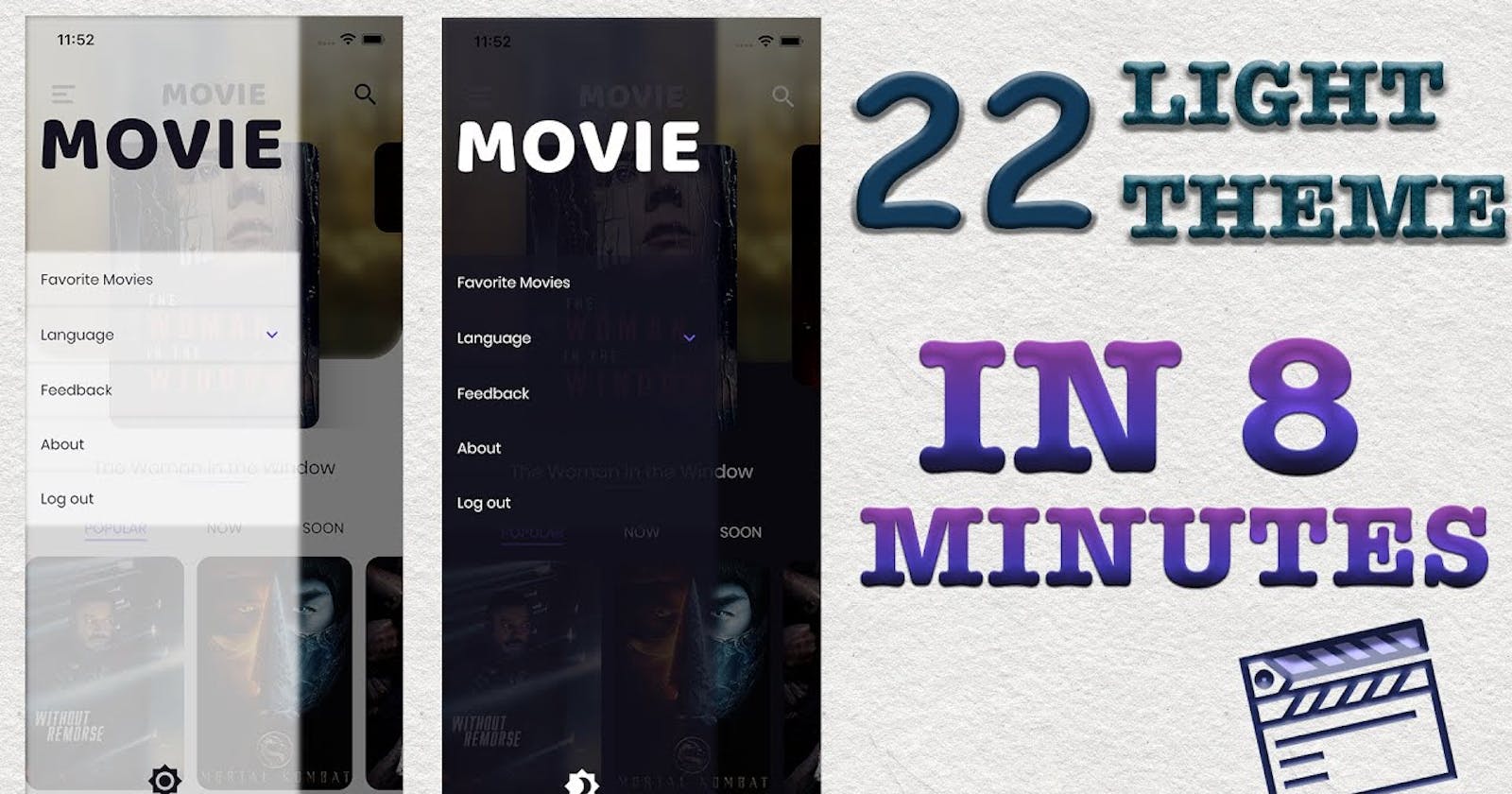
Introduce Light Theme
From episode 1, we've considered only a dark theme for this app. So, now we'll introduce a light theme variant for this. Most of our themes can be toggled with ThemeData, so let's enhance that and talk about the significance of each property of ThemeData one by one.
The scaffoldBackgroundColor
Based on the theme, you'll change the scaffoldBackgroundColor in the ThemeData. This will change the background of all our screens like the home screen, movie detail screen, favorite screen, search screen, trailer screen, login screen. Add brightness as well to dark or light based on the current theme, this will apply some default theme changes to the whole app. Run the app after this change and you'll be amazed.
scaffoldBackgroundColor: theme == Themes.dark ? AppColor.vulcan : Colors.white
brightness: theme == Themes.dark ? Brightness.dark : Brightness.light
Light Text Theme
Let's create a new set of text styles to support a light theme. Use copyWith and only change the colors, wherever appropriate. We create, vulcan colored versions of all the white colored text. Then, we create a new light text theme with these text styles. We keep the button style as it is because we have a gradient-colored button that will be the same in dark and light modes.
static TextStyle? get _vulcanHeadline6 => _whiteHeadline6?.copyWith(color: AppColor.vulcan);

static TextStyle? get _vulcanHeadline5 => _whiteHeadline5?.copyWith(color: AppColor.vulcan);

static TextStyle? get vulcanSubtitle1 => whiteSubtitle1?.copyWith(color: AppColor.vulcan);

static TextStyle? get vulcanBodyText2 => whiteBodyText2?.copyWith(color: AppColor.vulcan);

static getLightTextTheme() => TextTheme(
  headline5: _vulcanHeadline5,
  headline6: _vulcanHeadline6,
  subtitle1: vulcanSubtitle1,
  bodyText2: vulcanBodyText2,
  button: _whiteButton,
);
Before running, let's switch the text theme based on the current theme. After these changes, run the app, this time almost all our text is fixed with proper colors.
textTheme: theme == Themes.dark ? ThemeText.getTextTheme() : ThemeText.getLightTextTheme()
The primaryColor and accentColor
Let's also change the primary and accent color in the ThemeData. With this
primaryColor: theme == Themes.dark ? AppColor.vulcan : Colors.white
accentColor: theme == Themes.dark ? AppColor.vulcan : Colors.white
The CardTheme
In MovieDetailScreen, we have cards of the cast. Let's define a common theme to that in ThemeData.
cardTheme: CardTheme(color: theme == Themes.dark ? Colors.white : AppColor.vulca)
The InputDecorationTheme
We defined the InputDecorationTheme for the fields in LoginForm directly in the widget itself. Instead, we should have defined it in ThemeData. If you look at the login screen now, you'll understand what I mean.
inputDecorationTheme: InputDecorationTheme(
  hintStyle: Theme.of(context).textTheme.greySubtitle1,
  focusedBorder: UnderlineInputBorder(
    borderSide: BorderSide(
      color: theme == Themes.dark
          ? Colors.white
          : AppColor.vulcan,
    ),
  ),
  enabledBorder: UnderlineInputBorder(borderSide: BorderSide(color: Colors.grey)),
)
Random Changes
After most of the changes are done in ThemeData, we are left with some small changes. Like, Logo color change to vulcan in various places, for example, navigation drawer, movie app bar.
//Logo
color: context.read<ThemeCubit>().state == Themes.dark
  ? Colors.white
  : AppColor.vulcan,
Similarly, apply this to all the icons that we have in the movie app bar, movie detail app bar, and search bar back button.
Guest Sign In
Let's move to add Guest Sign In button. We will add a guest sign-in button in the LoginForm. On tap of this, we'll return success login from the cubit without making any API call.
//LoginForm
Button(
  onPressed: () =>
      BlocProvider.of<LoginCubit>(context).initiateGuestLogin(),
  text: TranslationConstants.guestSignIn,
)

//LoginCubit
void initiateGuestLogin() async {
  emit(LoginSuccess());
}
Logout Error
After null-safety migration, we have got one issue in logging out.
Unhandled Exception: type 'Null' is not a subtype of type 'FutureOr' in AuthenticationLocalDataSourceImpl. Let's make the return type nullable type.
//Return Nullable String
@override
Future<String?> getSessionId() async {
  ...
}
After this, you'll get a compilation error in AuthenticationRepositoryImpl. For that, wrap the call with the nullable check.
if (sessionId != null) {
  await Future.wait([
    _authenticationRemoteDataSource.deleteSession(sessionId),
    _authenticationLocalDataSource.deleteSessionId(),
  ]);
}
Summary
You must have seen how easy it was to switch between themes because we followed some rules from episode 1. We used TextTheme, religiously, which eventually solved 50% of our theming issues. With proper ThemData defined, your app is all ready for switching themes in quick time.
Thanks for reading.