17. Loader and Splash Screen

With 11+ years of experience in IT industry, I have got my hands into many tech stacks - mobile app development, data analytics, backend using Java/Kotlin.
I expertise on Android(Kotlin) and Flutter(Dart).
I also run a educational YouTube channel with name TECHIE BLOSSOM.
Welcome back, Glad that you are here.
We're building a Movie App with the best coding practices and tools. In the previous tutorial, we worked on authentication and at the end of the tutorial, I asked what you want to see in the next tutorial.
In this tutorial, we will add a loader while making API calls and also add a Splash screen on the app launch. The loader will be shown for fullscreen and will be hidden when there is either a success or failure for the API call. By this loader, we only want to notify the user that something is being fetched and we want the user to wait.
Before, I move forward let me make a small appeal. Due to a lot of office work, I am finding very little time from some months to write tutorials and complete this series. Many items are getting added into the series from your comments and I have seen a great response from you all. So be patient and please share these series with your friends or anyone new to Flutter. If I get more viewers for this series, it is better for both you and the channel. This whole channel is available to you for free and the only income that I get from this is from Advertisements. So, please share it as much as you can.
Creating Flare File
For creating beautiful and complex animations, we can take the help of Rive. Open Flare Rive or Rive both can enable you to create an animation. If you are not a designer but need a complex and nice animation you can fork any of the existing flare animations. I have used Flare Rive (the older version), to fork one existing animation and changed it as per the app theme. After editing the animation, you can save the file in your account and download the flare file. You'll download this flare file in your assets folder.
Create Loading Screen
Now, we will use this animation and load it when the app starts. For this, we will create a new journey - loading. This will have a screen - LoadingScreen. For testing this screen, we will open this screen instead of LoginScreen by replacing the initial route value.
Create a stateless widget -
LoadingCircle, in the loading journey
class LoadingCircle extends StatelessWidget {

  final double size;

  const LoadingCircle({Key key, @required this.size}) : super(key: key);

  @override
  Widget build(BuildContext context) {
    //1
    return SizedBox(
      width: size,
      height: size,
      //2
      child: FlareActor(
        'assets/animations/loading_circle.flr',
        animation: 'load',
        snapToEnd: true,
      ),

    );
  }
}
- Here, we are fixing the size of the animation.
- We will use
FlareActorto load the animation. One animation file can have many animations defined, so here we want to load the animation named load.
Now, create a screen in the same journey that will contain this widget in the center.
class LoadingScreen extends StatelessWidget {
  @override
  Widget build(BuildContext context) {
    //2
    return Container(
      decoration: BoxDecoration(
        color: AppColor.vulcan.withOpacity(0.8)
      ),
      //1
      child: Center(
        child: LoadingCircle(
          size: Sizes.dimen_200.w,
        ),
      ),
    );
  }
}
- In the
Centerwidget, use theLoadingCirclewith some size. Change the route for the initial screen toLoadingScreenand run the application. You'll see the white screen with animation. - Now, let's add some transparent background to it so that we can cover the screen with the same theme color and don't show the user with two light and dark colors in a split-second time.
Bloc
We need a bloc to which will handle the visibility of the loading circle. To explain this in more detail, consider this flow of events. When we make an API call, we want to show loader and once the API call is complete, we want to hide the loader.
For this, we will create a new bloc -
LoadingBloc.
class StartLoading extends LoadingEvent {}

class FinishLoading extends LoadingEvent {}
Here, you'll have 2 events - StartLoading and FinishLoading.
In the state class, create states correspondingly
class LoadingStarted extends LoadingState {}

class LoadingFinished extends LoadingState {}
Let's bind events and states in the bloc now
if (event is StartLoading) {
    yield LoadingStarted();
} else if (event is FinishLoading) {
    yield LoadingFinished();
}
This is the easiest bloc that you'll ever write. You'll feel why this much boilerplate for just simple stuff. But, we have no other option because we cannot use setState() and we haven't migrated to cubit yet.
Where is Loader in Tree Hierarchy
The loader will be loaded on top of the main screens. So, we will use Stack where each screen will be the first widget and LoadingScreen will be the second widget.
Let's handle the bloc and add stack in the
LoadingScreen
//1
final Widget screen;

const LoadingScreen({Key key, @required this.screen}) : super(key: key);

//3
return BlocBuilder<LoadingBloc, LoadingState>(
    builder: (context, state) {
    //2
    return Stack(
        fit: StackFit.expand,
        children: [
        screen,
        if (state is LoadingStarted)
            Container(
            decoration:
                BoxDecoration(color: AppColor.vulcan.withOpacity(0.8)),
            child: Center(
                child: LoadingCircle(
                size: Sizes.dimen_200.w,
                ),
            ),
            ),
        ],
    );
    },
);
- Declare a widget - screen that will be the first element of Stack.
- Now, use
Stackto put the screen behind the Loader. - Wrap the
StackinBlocBuilderand show the loader only when the state isLoadingStarted. ForLoadingFinished, we will have only 1 child i.e. the screen itself.
When you run the application there is an error because we have used BlocBuilder but have not provided the bloc above the tree. So, let's work on the MaterialApp to use this LoadingScreen as a parent widget in our app and provide the LoadingBloc at the very start. Let's add this bloc in getIt and use it.
Open
MovieAppand add a new bloc
//1
LoadingBloc _loadingBloc;

//2
_loadingBloc = getItInstance<LoadingBloc>();

//3
_loadingBloc?.close();

//4
BlocProvider<LoadingBloc>.value(
    value: _loadingBloc,
),

//5
builder: (context, child) {
    return LoadingScreen(
        screen: child,
    );
},
The steps are simple and repetitive as in the previous tutorial.
- Declare the bloc.
- Get the instance of
LoadingBlocin theinitState(). - Dispose the
LoadingBlocin thedispose() - Provide the
LoadingBlocas other blocs. - Instead of returning
child, we will now wrap this withLoadingScreen.
After hot reload, you'll see an error that the first index of Stack is null. It is because in the Routes we haven't reverted the temporary changes. So, change the initial screen back to LoginScreen. Now, if you reload, the errors are gone.
Add Loader for Screens
We will not see the loader until we dispatch the StartLoading event wherever required. Let's first do the simple stuff. Add the loader to the home screen, movie detail screen, and search screen.
So, open get_it.dart and add the LoadingBloc dependency for the 3 blocs.
getItInstance.registerFactory(
    () => MovieDetailBloc(
      getMovieDetail: getItInstance(),
      videosBloc: getItInstance(),
      castBloc: getItInstance(),
      favoriteBloc: getItInstance(),
      loadingBloc: getItInstance(),
    ),
  );

getItInstance.registerFactory(
    () => MovieCarouselBloc(
      getTrending: getItInstance(),
      movieBackdropBloc: getItInstance(),
      loadingBloc: getItInstance(),
    ),
  );

getItInstance.registerFactory(
    () => SearchMovieBloc(
      loadingBloc: getItInstance(),
      searchMovies: getItInstance(),
    ),
  );
Now, yield the StartLoading and FinishLoading states before and after the API calls in these blocs.
One example is -
loadingBloc.add(StartLoading());

loadingBloc.add(FinishLoading());
After adding these statements in all the 3 blocs, when you run the application you'll see the loader for a very small duration. You can add a delay in the _client.get() to see the animation. After adding a delay of 10 seconds, we can see the loader.
For adding in the login screen, you'll do the same thing. So go ahead, and do it yourself.
Add Loader in sections
When we want to show loader in small sections of the app when the tabs are switched, we will have to use LoadingCircle directly.
First, add another intermediate state for MovieTabbedBloc - MovieTabLoading
class MovieTabLoading extends MovieTabState {
  MovieTabLoading({int currentTabIndex})
      : super(currentTabIndex: currentTabIndex);
}
When the event is MovieTabChangedEvent in the MovieTabbedBloc, you'll yield the MovieTabLoading state.
In MovieTabbedWidget, you'll handle the MovieTabLoading state and load the LoadingCircle.
if (state is MovieTabLoading)
    Expanded(
        child: Center(
            child: LoadingCircle(
                size: Sizes.dimen_100,
            ),
        ),
    ),
Splash Screen
Our Splash screen is very simple and clean. We just want to show the logo at the center of our screen. I have already created the images for different sizes and now we will use them in iOS and android projects. Let's first add to the iOS folder.
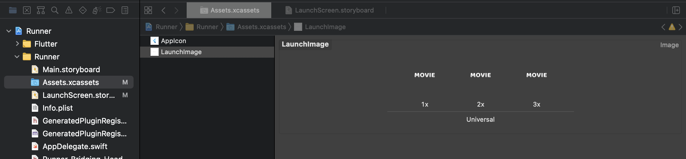
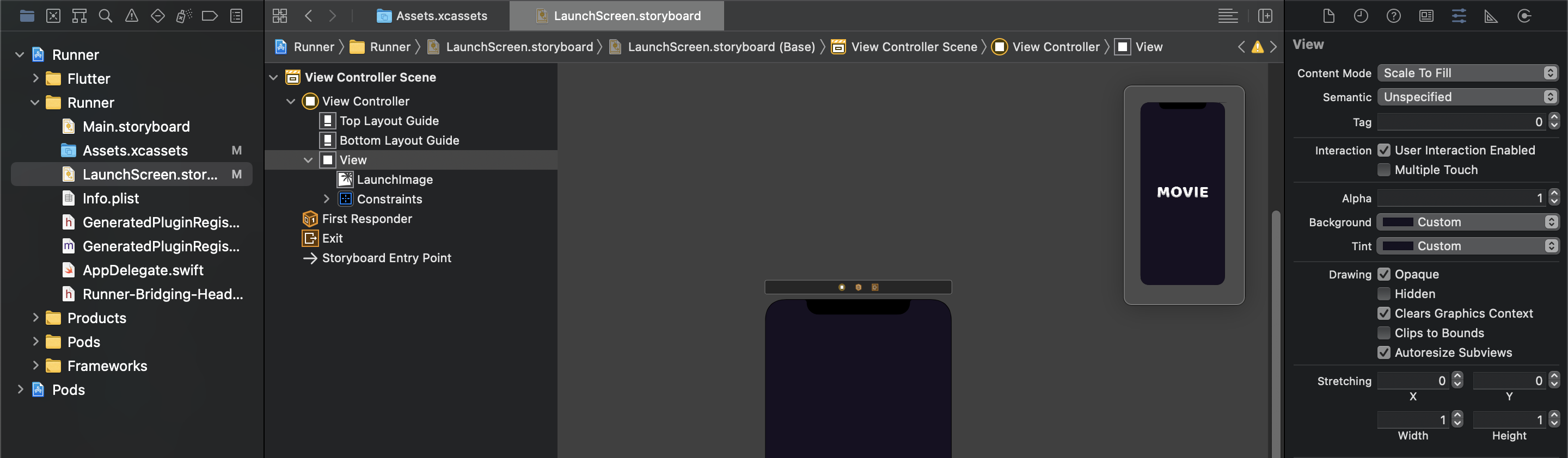
You should have 1x, 2x, and 3x image sizes. Open the ios folder in XCode.
In the Runner folder in XCode, open the assets folder. You'll copy the logos in 1x, 2x, and 3x versions. Then, you'll change the background color for the screen to the app color. You should verify that logo is well fitted in each form factor. Now, run the app and you'll see the splash in the iPhone simulator.
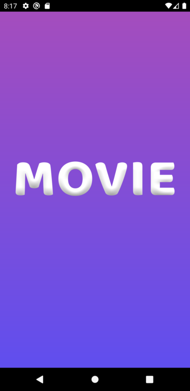
Let's copy the same images in the android project. Here, you'll find various folders for different form-factors like mipmap-hdpi, mipmap-xhdpi, and so on. After copying these files into respective folders, you'll need to use this logo.png in res -> drawable -> launch_background.xml. Interestingly, in android, we can use gradient. So, we will add gradient as well
<layer-list xmlns:android="http://schemas.android.com/apk/res/android">
    <!-- 1 -->
    <item>
        <shape>
            <gradient android:angle="270"
                android:startColor="#A74DBC"
                android:endColor="#604FEF" />
        </shape>
    </item>

    <!-- 2 -->
    <item>
        <bitmap
            android:gravity="center"
            android:src="@mipmap/logo" />
    </item>
</layer-list>
- The first layer acts as a background.
- The second layer is for the logo.
Now, run the app and see the splash.
This is how it will look on android
I will see you at the next tutorial. Let's do Bloc to Cubit next? What do you say? Let me know in the comments section. Thanks for watching. Goodbye.


